Marking an economics graph interpretation
A demand shift example separates reading the graph from explaining the change.
The question
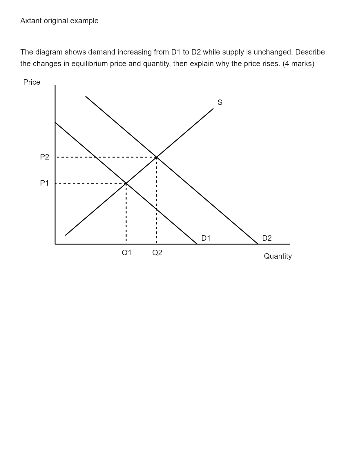
The diagram shows demand increasing from D1 to D2 while supply is unchanged. Describe the changes in equilibrium price and quantity, then explain why the price rises. (4 marks)
The marking guide
- Award 1 mark for price rising from P1 to P2 and 1 for quantity rising from Q1 to Q2.
- Award 1 mark for explaining excess demand at the original price after the demand increase.
- Award 1 further mark for explaining that upward pressure on price brings quantity demanded and quantity supplied back into balance.
The sample response
Price rises from P1 to P2 and quantity rises from Q1 to Q2. At the old price, consumers want to buy more than producers supply. This shortage puts upward pressure on price until demand and supply balance at the new equilibrium.
Axtant’s mark and feedback
You identify the rise in price and quantity, explain that excess demand occurs at the old price, and describe how upward pressure on price restores balance at the new equilibrium.
Why the guide matters here
The response reads both axes and explains the adjustment. It does not confuse a shift of demand with movement along the original demand curve.
A useful teaching follow-up
Keep the graph available while checking the explanation. A correct general mechanism does not excuse reading the plotted direction incorrectly.
Try it with your material
This practice question, guide and sample response were written for Axtant. The mark and feedback shown are Axtant’s own for that response.